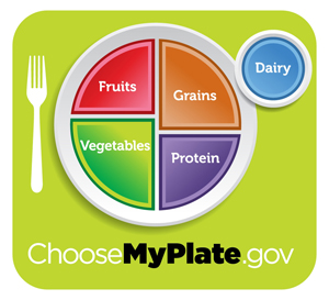
Say ‘Goodbye’ to the MyPyramid and ‘Hello’ to MyPlate

Today, the USDA announced it will be using a new image, appropriately named MyPlate, to replace the Food Pyramid in its efforts to help American’s eat healthier, more balanced meals.
THE LOOK
 With its simple design and color scheme that designate the different food groups and proper portions for meals it certainly is a more straightforward visual display when compared to the complex food pyramid’s of the past that contained multiple layers, 3D images, steps, and even provided a key to designate what certain symbols were within the pyramid itself.
THE CONCEPT
The concepts behind the new icon is broken up into 3 messages:
- Balancing Calories
- Foods to Increase
- Foods to Reduce
To balance calories the USDA offers strategies like avoiding oversized portions and “enjoying your food, but eating less.”
Foods to increase include fruits, veggies, whole grains, and low-fat dairy.
Foods to decrease include high sodium and high sugar foods like soda.
THE BOTTOM LINE
Ultimately, MyPlate was put in to place to provide a clearer picture of what a healthy meal should look like and to be utilized as a launch point for long-term positive dietary change. But will it? I think it certainly could. It really depends on how health professionals approach the new icon and how the general public receive the fact that there is yet another new national model for healthier eating.
YOUR THOUGHTS ON MYPLATE
Love it? Hate it? What are your thoughts on the new icon? Do you think it will change the eating habits of American’s? Please leave a comment and let us know! You can also tweet your comments on twitter under the hashtag #MyPlate, #FoodIcon, or #NLchat and let us here at Nutrition Lately know what you think.


